THE HIGHLY SATURATED PHOTOGRAPHY MARKET
The not-so-welcome rain returned in the second afternoon of our weekend art show a few weeks ago. I quickly put down the side covers to protect the framed prints on the outside of our booth. This created a welcoming retreat for a few patrons stuck out in the rain.
Shortly, a couple of old geezers (about my age) showed up. It was clear they were experienced photographers by their comments and the logos on the hats they wore. Normally, an exhibitor doesn’t want to spend a lot of time with other photographers as you are trying to sell your art, but this was a perfect time for casual conversation as the rain pattered down on our canopy and potential customers had sought shelter in the bars and coffee shops that surround Prescott’s plaza.
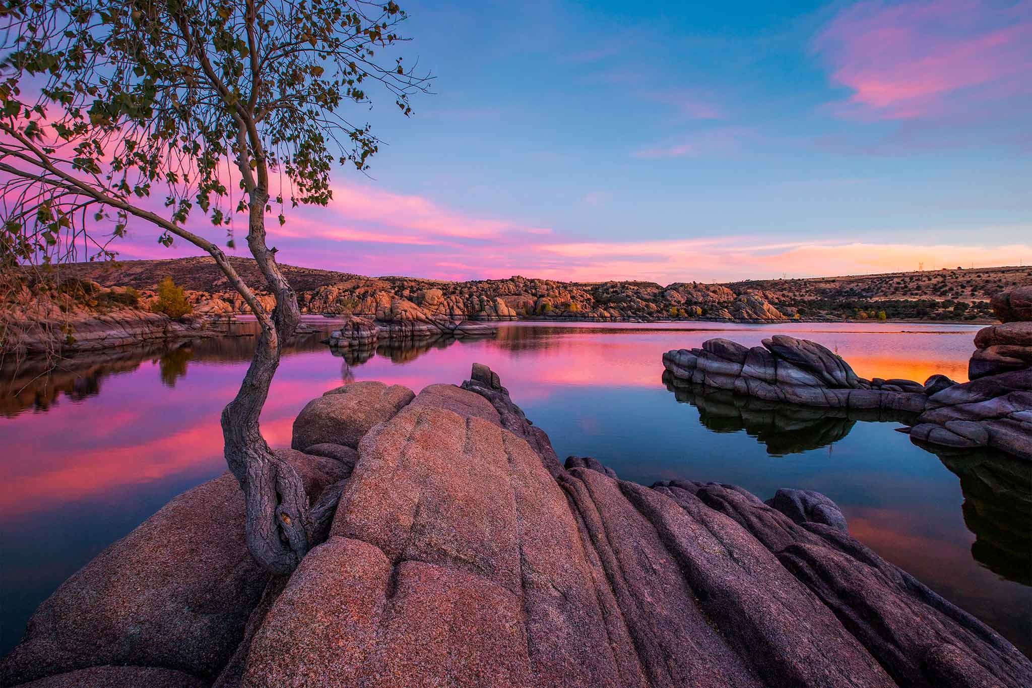
One of the photographers asked, “Do you know what I really like about your photography?” I held back the more desirable “Everything!” Instead, my response was, “Yes, you like that I don’t oversaturate my images.” I was right. Yes, there is a growing tendency for photographers to present highly saturated images, and for a reason. Saturation sells. The more gaudy a print, the more attention it will garner. It is more likely to sell, especially to first time buyers of photographic art. Most of us care more about selling some of our work. That is affirming and it helps pay the bills. But these old guys appreciated where photography came from. By not highly saturating images, it is possible to bring out a wider tonal range in the mid tones. This is attractive to me as well as those photo geeks. This article is not about the market being over-saturated with photographers which it certainly is, but photographers over-saturating their work.
Perhaps it is wise to define saturation here. There are three elements to color. Value is the brightness or dimness of a color. The higher the value, the brighter the color. It is also referred to as luminance. Hue is the shade of the color. So for reds we may have hues described as vermilion, crimson or cherry. It has to do with how much of the colors green and blue have been added to the red. Saturation is the intensity of the color. The more intense or pure the color, the more saturated it is. Photographers can adjust all these features and they can do so selectively (say just the blues) as they process their images.
There is some difference between highly saturated and oversaturated. A highly saturated image or print means there are many colors that approach the maximum intensity of one or two of more of the primary additive colors red, green and blue. A highly saturated yellow would have near the maximum amount of red and green. A highly saturated magenta would have near the maximum amount of red and blue. You get the idea. Oversaturated is mostly a subjective term. That means my opinion can differ from your opinion. For me, it means saturated to a point that it looks unnatural. But others might interpret it as saturation to the point that detail is lost in the the saturated colors. Let’s say you have an orange sunset that has some red in it. As you bring the reds and yellows and oranges all to maximum saturation, they start becoming three distinct pure colors rather than having gradual tones between them.
My waterlogged visitors were quickly becoming my new photo buddies. We discussed old techniques, black and white photography, color darkroom printing and more. It became clear that they were stuck in the past in evaluating color and saturation in photography. They could not appreciate over-saturation because of their history. But, now I am wondering if I am also stuck in the past.
Several situations encourage photographers to heavily saturate their photography. For you non-photographers, all it takes is putting your mouse over a slider type of button in Photoshop or other programs and moving it to the right to increase saturation. Presto, change-o! It’s done. Highly available and reasonably cost effective metal prints also enhance saturation. Then, we are likely to get the most likes and “Wow”s on Facebook or Instagram when we post our highly saturated sunsets. It’s the golden hour or just past. That’s when we are supposed to have our cameras out to capture the most saturated scenes possible?
After a couple sales of highly saturated prints, staying away from that saturation slider is like Barbara trying to keep me away from chocolate chip cookies when she isn’t home. Next to impossible. They shouldn’t have made that slider so accessible if it wasn’t supposed to be used all the time!
If you are a photographer and have developed a style that shows a consistently high degree of saturation and that is working for you, please do not change. This is you. If you have not yet developed a style, I would encourage you to let two other features stand out above saturation. These are composition and light. But also consider that some of the most successful photographers out there actually desaturate portions of their images. Yes, they move that pesky slider to the left!
The question usually goes, “Which is more important, composition or light?” The answer for me is that they both have to be outstanding for a great image. The answer is never color. A black and white print can be a great image. That does not mean color is not important. Having harmonious colors that work together is extremely important. But it is less critical to keeping a viewer in the image, which should be our goal? We want our viewers to stay with our image as long as possible. The arrangement of objects and shapes in our image and the way light directs the viewer through the image are the key factors to art. Color should be complimentary to this, adding emotions such as excitement, peacefulness, melancholy, and warmth. It should give us more feeling with the image.
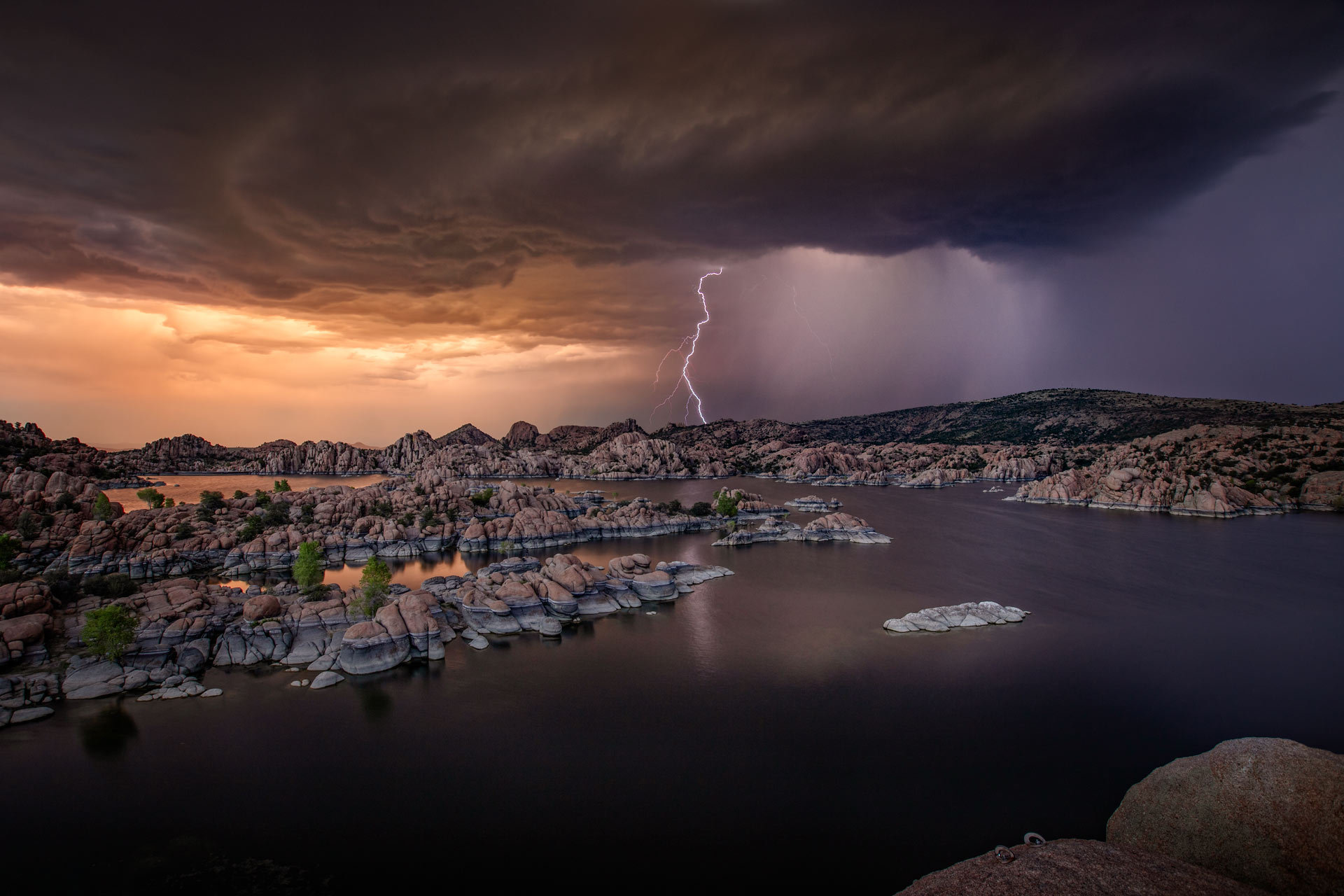
Composition draws us to our subject as does light. Color can do the same, so it should be applied to do just that. There is a tendency for us to photograph the brilliant sunrise or sunset at the expense of the subject, a waterfall, for instance. In my opinion, this does not make a compelling image. Make your sunsets work with the land or water below.
Color and its saturation level may say something about the photographer. My career as a dentist meant I had to stay under control all the time. My colors are controlled. If you are out line dancing on Friday nights or wear a cheese hat to Packers games, you might be a more “colorful” artist. That would be natural for you. But, if you are a sedate person, you won’t be arrested for going wild occasionally and if you are hell on fire, you might just settle down a bit and see how well you wear a more peaceful side.
If you are a buyer of photographic art or if you are a photographer who just can’t keep your mouse off that saturation slider, I encourage you to use caution and apply these questions:
- Does saturation detract from what this picture is about?
- Are the colors harmonious and not competing with each other or the subject?
- Are the colors most intense on the subject and not on the outer areas of the image?
- How are my own tastes in photography changing because of the initial response to images? Am I being true to myself?
- If my picture was on a wall, would the I return to it over and over again, or would it get old quickly?
I am wondering what I would have written had my most highly saturated images sold instead of the ones I prefer!
If you are a photographer, you might want to read my more technical article on the many ways to stay in control when you modify saturation.
RS


