Crooked Photographers

The reason those folks thought the world was flat many centuries ago is that that was what they saw with their own eyes. But by the looks of many pictures I see posted online, the world is crooked. Because I'm a generally positive person I don't want the world or photographers to be crooked. So let's see what we can do about straightening up photographers...and their photographs. I am guilty of capturing some pretty tilted scenes, so I will be speaking to myself as well as you.
Besides out of focus photographs, nothing upsets a seasoned photographer or a discerning viewer quite so much as a tilted photograph. This is the most common issue I see from beginners, but just like gamblers, all photographers will tilt at times. It happens especially when shooting hand held but also when one rushes things on a tripod. Tilted images show up especially when you have a flat horizon such as a lake or an ocean, or straight horizontal lines such store front shot straight on. When everything in you image is shot with a perspective view you will have to decide which lines should serve as your reference points.
Be sure to click to enlarge the smaller images that may be cropped for webpage display.
Many digital cameras have a built in level and/or a grid that can be turned on or off. I recommend you use either the level or a grid. My preference for a grid is one that divides the image into nine parts, so the grid serves an extra function by helping us stay aware to keep our subjects off center. The best place to correct a tilted image is in camera. If you use a built-in level, it will normally be white or yellow when your camera is not level and it will turn green if your camera is level.
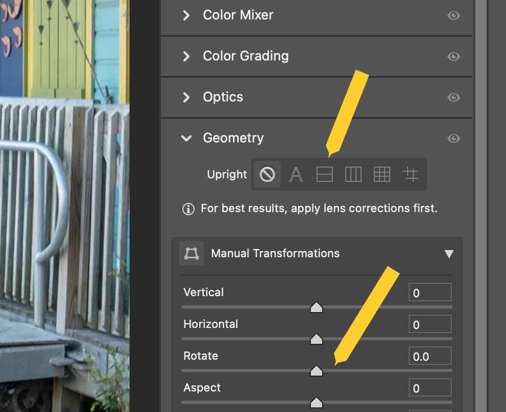
Many smartphones allow you to correct (level) an image directly in the phone’s software. When you level an image you will then have to crop the blank areas off, reducing the size of your available frame. Likewise, you may level an image in any post processing program. For some images you can use a fill in technique (content aware fill) to replace the blank wedge areas you end up with. This can be a problem, however, as it will you may lose part of what you want to keep or your fill may look strange. In some instances you can use “content aware fill” to replace the corners you lose. If there is much detail in those areas this won’t work so well.
These comments aren’t meant to stifle your creativity with intentionally tilted images, but in my experience those are most effective on Instagram rather than as display prints.

You must exercise care when when there are multiple visual cues in your frame. Here, if you were to take just an isolated picture of the juniper, the sandstone layers behind it would have you orient the frame as shown. The distant mesas provide an additional and more reliable cue when the shot is framed as I have done. The goal was to have the juniper "introduce" the viewer to the valley and mesas beyond. Had I used the level in my camera I would not have to crop the image, or if I had moved back further from my subject the problem could have been solved with cropping.

The visual cues in this image are the pools at the base of the waterfall and the vertical lines of falling water in the center of the image. The pool on the left does not look right due to perspective, even if the camera is level. Our brain tells us that the water in the pool should look level.
Some photographers will wait to level images until they have done all their post processing. I prefer to level the image first as it reveals issues that come up with finishing the image. These issues include the loss of desired elements along the borders, whether it is possible to use content aware fill for the wedge areas lost along the border and whether cropping has moved distractions to the border.

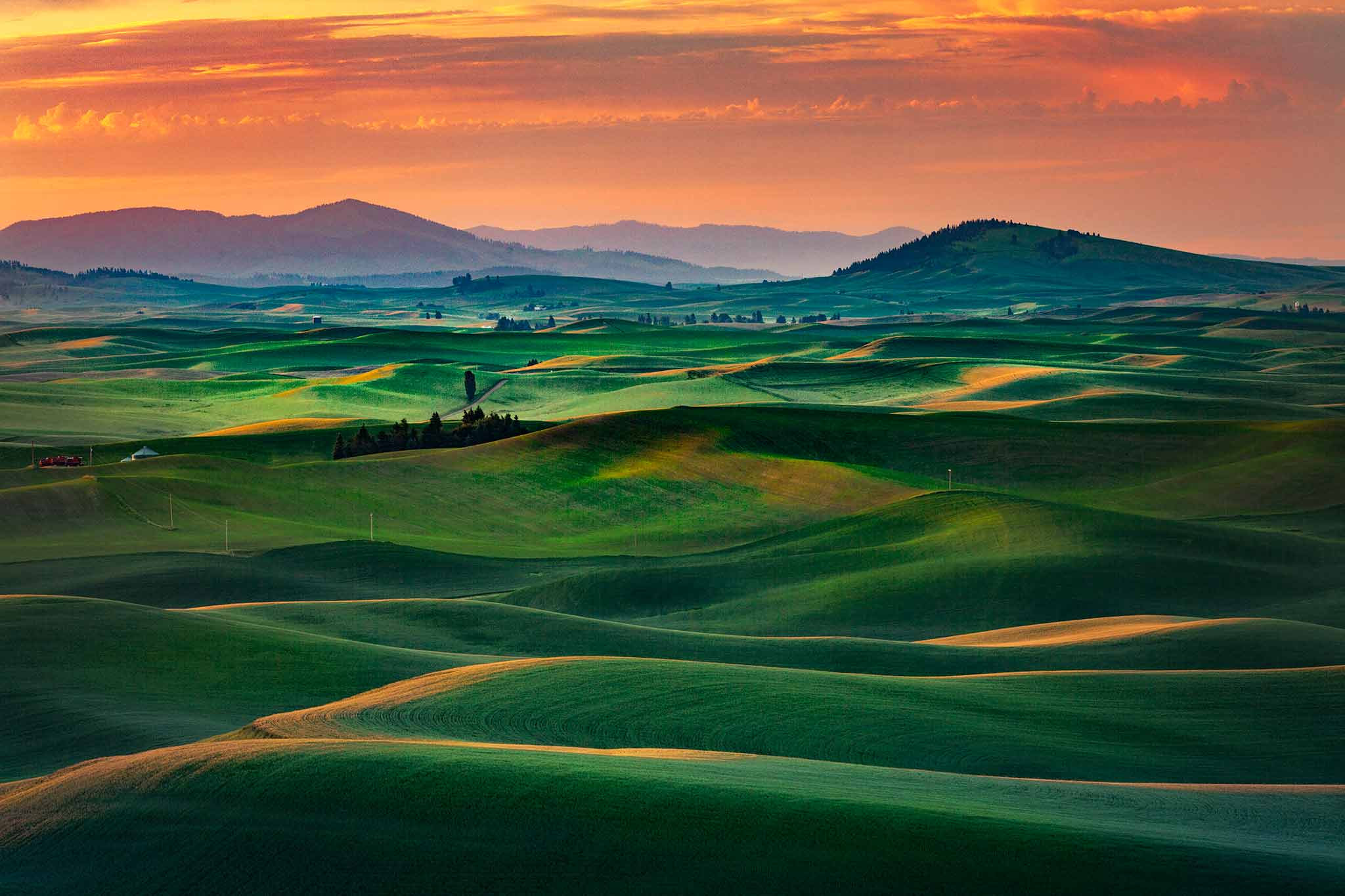
Lakes can be particularly troublesome when the far shore is angled toward or away from you. What looks level is not always the best choice. In this image, there is a feeling that the lake slopes a bit to the right.

When images include perspective and straight features, our eye can be fooled when composing, but there are usually areas the provide the best cues. Look for horizontal and vertical lines near the center of your image. If you are using a wide angle lens, there are likely to be distortions towards the outside of the image (see the light pole). You can reduce those distortions by using lens correction in your post processing program and sometimes by using the transform tools in post processing.
In this image the railing on the right was improperly used as the reference level. The railing in front of the diners is in the center of the image AND it is approximately the same distance from the camera on both the left and right.
Your best leveling tools are your camera and tripod, along with the visual cues you recognize before taking a photograph. Reduce the need for post processing leveling by composing your scene carefully in the first place. In this way you will minimize the agony of your exceptional photos that become unusable because they can't be leveled without changing your intended composition.
RS


